Lingscape
Log in
Lingscape Public Image Repository
About the project
|
Project list
|
Taxonomies
|
License
Filter data
Projects set
All pins
¡Mira Español!
'SPOT GERMAN' in Tirana
1LLBiel
2LLBiel
3LLBiel
4LLBiel
50upb
5LLBiel
6LLBiel
AlpiLinK
BA Linguistic Landscape
Barcelona-Protest
BayMuc
Beč - Wien
Bremen-LL
BWUAnglicismTour21
Cdp
Christkindl
Colorado Spanish
CommCity Berlin
Constructing Omiyage Space in a Local Supermarket
CPH Amager
CSA19-Deub7
CSA19-Don9
CSA19-Goethe5
CSA19-Lang4b
CSA19-Lang8
CSA19-Neu9
CSA19-Obern5
DaZ- Seminar 2022
DEXmasMarkets
El Salvador
EmpMethSS19
error404
Español en Colonia
ess:inn
F_Anvers
Fav_Col
Favorita
Francoviennois
FranzoesischWien1
FranzoesischWien2
FranzoesischWien3
Freiburg/Fribourg2025
Fribourg/Freiburg
GKv
GOEN
Graffiti
GuK
GZDe-2019
Hackney2
HHU Campus
IAL FWDE2A L5
IamDiÖ
IamDiÖ-CSA19
IamDiÖSB18
ID_NEW
IESVienna
IkM_A
INGRID
Issime
Italianismi
italiano a Mannheim
KAGraffiti
KauVln25
KFB_2025
KLICK
Koomitest
L&A - political signs
LA
Languages
Lassouts
Letreros en el RGV
Letreros SD
Leuven-Stickers
Lewis_Lorain
Ling study EDC&I
LING_LAND_ARÉVALO
Lingscape Zermatt
LingSchu
Linguistic Landscape Werftpark Kiel
LingZahre
Litfass
LL Mannheim 24
LL of KL LRT
LL-AA-ND
LL-CZ-AT
LL-Kortrijk
LL-Politics_Südtirol
LL@Viadrina
LL@Viadrina2025
LL24Ischia
LLBiel1
LLBiel2
LLBiel3
LLBiel4
LLBiel5
LLBiel6
LLEFLT
LLRS
LLSüdtirol
LLZIMBRISCH7KOMÄUN2023
m_kenik_1
m_kenik_2
M.A.N.
MA LL
MA1.0
MechelenCreativity
MeerAnt
Mehrsprachigkeit
Moldau RO/RU
MR24_LLfem
MultiBZ
multiling
Multilingual Hawaiʻi
MultilingualNewJersey
MultilingUniKN
Niederdeutsch
OAIBleiburg2022
OPOling CITYscape
Oschi
PaisajeLingüísticoyMigraciónenMontevideo
PALRA
Paris
Pidgin in Public
PiK
Pitt in Siracusa
PLAT
PLMilano26
Poke in Belgium
Praxis
Praxis 2024
Project 51°N
Projektseminar zu Lingustic Landscape
Proteststicker
PSDN
PSDN_Z
Q
Queer LLs
Regulatorische Zeichen
ReLi
RILL
RinT
ROREV89
RUGscape
Ruperti
SB_LL_23
SchBeLL
SciScape
SCL
SEVisibLL Probe
Sicherheit in der Stadt Bern
SL
Sociolinguistic Methods
sorbLL
Spanish as vice
SpanPasc
Sprach-Checker
Spravieltraka
Streetsigns
SVM-Bad Belzig
SVM-Cottbus
Swedish LL in city of Porvoo
testiest
Thesis
thk
Tsunosahafu
TypeWalk
UB2022
UberMZ
UNI.LU-1718 Luxemburg Stadt
UNI.LU-1718 Non-French Signs
UNI.LU-1718 Schilder Esch
UNI.LU-1718 Straßen und Städte
UNI.LU-1718 Straßenschilder
UNI.MZ-1718 RestoMZ
UNI.MZ-1718 BhfMZ
UNI.MZ-1718 CampusMZ
UNI.MZ-1718 EnglischMZ
UNI.MZ-1718 MZMultiKomm
UNI.MZ-1718 SKMZ
UNI.MZ-1718 TransgrEngMZ
Unibas_Wahlkampf
Unight-CS
USi
Valencia
VCSp
Venezia bottom-up
Vergleichskorpus
Versions of Marx
VIEamour
Visible Turkish
VisibLL_VB1
VisibLL_VB2
VisibLL_VG1
VisibLL_VG2
VisibLLRudolphina
VM-MUC (tur)
VOICETER
Wartehäuschen-LL
Werbung
WienerHbf
WINDMAP
Winter School
WL
YU-LL
Zu der LL von Köln
Pins without project password
Languages set
All pins
Аҧсшәа (Abkhaz)
Afrikaans (Afrikaans)
Ákán (Akan)
አማርኛ (Amharic)
العربية (Arabic)
Bable (Asturian)
Azərbaycanca (Azerbaijani)
Boarisch (Bavarian)
беларуская (Belarusian)
বাংলা (Bengali)
Bislama (Bislama)
བོད་སྐད (Tibetan)
bosanski (Bosnian)
brezhoneg (Breton)
Български (Bulgarian)
Català/Valencià (Catalan/Valencien)
Čeština (Czech)
Ivilyuat (Cahuilla)
zimbar (Cimbrian)
crnogorski (Montenegrin)
Kernowek (Cornish)
Corsu (Corsican)
pãmié (Cubeo)
Cymraeg (Welsh)
Dansk (Danish)
Deutsch (German)
Dolnoserbšćina (Lower Sorbian)
Ελληνικά (Greek)
English (English)
Esperanto (Esperanto)
Eesti (Estonian)
Euskara (Basque)
Extremeñu (Extremaduran)
Føroyskt mál (Faroese)
فارسی (Farsi)
Fala (Fala)
Filipino (Filipino)
Suomi (Finnish)
Français (French)
Francoprovensal (Franco-Provençal)
Noardfrysk (North Frisian)
Frysk (West Frisian)
Furlan (Friulian)
Gàidhlig (Scottish Gaelic)
Gaeilge (Irish Gaelic)
Galego (Galician)
Schwizerdütsch (Swiss German)
avañe'ẽ (Paraguayan Guarani)
ગુજરાતી (Gujarati)
kreyòl ayisyen (Haitian Creole)
Hausa | هَوُسَا (Hausa)
Hawai‘i (Hawaiian)
BCMS languages (Serbo-Croatian)
עברית (Hebrew)
Otjiherero (Herero)
हिन्दी (Hindi)
Hrvatski (Croatian)
Hornjoserbšćina (Upper Sorbian)
Magyar (Hungarian)
Hawai'i Creole (Hawaiian Creole English)
հայերեն (Armenian)
Interlingua (Interlingua)
Bahasa Indonesia (Indonesian)
Íslenska (Icelandic)
Italiano (Italian)
日本語 (Japanese)
Kalaallisut (Greenlandic)
ಕನ್ನಡ (Kannada)
ქართული (Georgian)
Қазақ тілі (Kazakh)
[!Kung, ǃXóõ] (San)
कोंकणी | Konknni (Konkani)
한국말 (Korean)
Kurdî | کوردی (Kurdish)
Kwangali (Kwangali)
ພາສາລາວ (Lao)
Lingua latina (Latin)
Latviešu (Latvian)
Lèmburgs (Limbourgish)
Lombard (Lombard)
नेपाली (Nepali)
Lietuvių (Lithuanian)
Ladin (Ladin)
Lozi (Lozi)
Lëtzebuergesch (Luxembourgish)
മലയാളം (Malayalam)
मराठी (Marathi)
Mòcheno (Mòcheno)
Mi'kmawi'simk (Miꞌkmaq)
македонски (Macedonian)
Malti (Maltese)
Māori (Māori)
bahasa Malaysia (Malaysian)
Mirandês (Mirandese)
မြန်မာစာ (Burmese)
Khoekhoegowab (Nama-Damara)
Diné bizaad (Navajo)
Plattdüütsch (Low German)
Nederlands (Dutch)
Norsk (Norwegian)
Occitan (Occitan)
Oromoo (Oromo)
[Ndonga, Kwanjama] (Oshivambo)
ਪੰਜਾਬੀ | پنجابی (Punjabi)
Papiamentu (Papiamento)
Piemontèis (Piedmontese)
Polski (Polish)
Português (Portuguese)
skicinuwatuwewakon (Malicite-Passamaquoddy))
پښتو (Pashto)
Rumantsch (Romansh)
Română (Romanian)
sicilianu (Sicilian)
Scots (Scots)
සිංහල (Sinhalese)
Русский (Russian)
gradišćansko-hrvatski (Burgenland Croatian)
Slovenčina (Slovak)
Slovenščina (Slovene)
åarjelsaemien gïele (Southern Sámi)
Gagana Sāmoa (Samoan)
Af-Soomaali (Somali)
Español (Spanish)
Shqipja (Albanian)
sardu (Sard)
Cрпски (Serbian)
Kiswahili | سواحلية (Swahili)
Svenska (Swedish)
ไทย (Thai)
தமிழ் (Tamil)
татарча (Tatar)
తెలుగు (Telugu)
тоҷикӣ | الفبای (Tajik)
Tagalog (Tagalog)
Setswana (Tswana)
Türkçe (Turkish)
اردو (Urdu)
Українська (Ukrainian)
oʻzbekcha | ўзбекча | اۉزبېکچه (Uzbek)
Tiếng Việt (Vietnamese)
Vlams (Flemish)
Walser Tiitsch (Walser German)
Хальмг | Haľmg (Kalmyk)
isiXhosa (Xhosa)
Veneto (Venetan)
ייִדיש (Yiddish)
Yorùbá (Yoruba)
isiZulu (Zulu)
ⵜⴰⵎⴰⵣⵉⵖⵜ (Tamazight)
普通话 (Chinese)
Ambilinguistic
No language
Other language
Pins without languages
Taxonomy set
All pins
Composition
Directedness
Discourse
Distribution
Dominance
Dynamics
Form
Gender representation
Integrity
Layering
Linguality
Material
Mode
Modification
Name
Placement
Scientific terminology
Script
Size
State
Status
Student & study life
Supplement
Temporality
Variety
Pins without taxonomies
Taxonomy term set
All pins
authorized
recognized
transgressive
artistic
commemorative
commercial
educational
expressive
folklore
informatory
ghost
infrastructural
operative
political
retired
private
bottom-up
regulatory
top-down
religious
conflictive
scientific
cultural
subcultural
dialogic
historic
linguistic
cardboard
chalk
alternating
fabric
flowers
complementary
glass
duplicating
ink
fragmentary
metal
background
mixing
paint
color
overlapping
paper
material
arabic
positioning
armenian
batak
quantity
bengali (Bangla)
size
berber (Tifinagh)
carved
braille
chiseled
burmese
cherokee
embossed
chinese
enameled
engraved
cyrillic
devanagari
handwritten
photocopied
ethiopic (Ge'ez)
hebrew
printed
scratched
georgian
glagolitic
sprayed
greek
gujarati
display panel
gumurkhi
plastic
graffiti
japanese (kana, kanji)
wood
information sign
javanese (Carakan)
mural
kannada
neon sign
khmer
note
korean (Hangul)
object (non-sign)
lao
plaque
latin
poster
stand
sticker
street sign
window
writing
lontara
malayalam
mongolian
oriya (Odia)
sinhala
syllabics (Canadian Aboriginal)
tamil
telugu
thaana
thai
tibetan
uyghur
yi
typeface
clarification
comment
correction
covering
destruction
extension
overwriting
removal
archival
strikethrough
historical photo
post card
dynamic
fixed
interactive
mobile
static
ephemeral
event-related
noise
monolingual
permanent
bilingual
trilingual
quadrilingual
multilingual
translingual
other
material
technical
other
other
touristic
transgressive
other
other
other
other
other
vanished
other
other
historic
local
national
non-standard
regional
standard
unclear
≤ A6
A6 – A5
A5 – A4
A4 – A3
A3 – 1m²
1m² – 4m²
4m² – 10m²
> 10m²
image
image-symbol
image-symbol-text
complete
image-text
symbol
extended
leftovers
symbol-text
text
partially covered
partially removed
superimposed
advertising pillar
(flower) bed
bench
bike stand
board
ceiling
chimney
display
door
drainage pipe
fence
fountain
furniture
gangway
garbage can
gate
gutter
hut
lamp post
memorial
pavement
person
plaque
post
poster
public transport stop
railing
road
roof
screen
sign
sky
stairs
telephone booth
toilet
traffic light
tree
vehicle
vending machine
ventilation shaft
wall
window
other
artist
authority
business
club
event
festival
hospitality
institution
person
place
political agent
religious agent
other
other
curricular
examinational
informal-student-life
institutional-bureaucratic
motivational
pedagogical
research-related
student-organizational
student-protest
study-environmental
other
gender-ambiguous
gender-balanced
non-binary or gender-inclusive
predominantly female
predominantly male
other
academic-scientific
historical-scientific
humanistic
institutional-scientific
interdisciplinary
natural-scientific
pedagogical-scientific
popular-scientific
public-scientific
social-scientific
technical-scientific
other
Pins without categories
App user set
All pins
:)
.
@ciro
@LorenzoPetrucciUNIBO
&soon
#RadYeti123
00- Researcher
00433105
00443914
00454190
00478393
01_Ash
02_Katherine
03_Audrey
04_Tomasso
0H0
12
12 2
123
13665
13785
230
3li
A.I.
A#00460273
A000000
A00373089
A00393919
A00406878
a00427207
A00427488
A00427535
A00428351
A00433105
A00435997
A00438323
A00438625
A00439267
A00443038
A00443320
A00443941
A00444281
A00445712
A00445920
A00446236
A00447868
A00447983
A00448400
A00450350
A00450530
A00452659
A00454186
A00454205
A00454650
A00459459
A00462250
A00462518
A00462951
A00464167
A00464167(second device)
A00465484
A00468265
A00468744
A00469217
A00469948
A00470739
A00471229
A00472639
A00473317
A00474304
A00475908
A00476336
A00477268
A00478050
A00478786
A00478899
A00479387
a00481724
a00484944
A00487043
AAA
ab
ABA
ABC
Abe.luna@hotmail.com
Abhee_Usani
ACorreia
Adah
Adam R.
addiethebaddie
Adelka
Adriane
Adrienn_Vig
Agata
Aggi
Agi
Agnes Kohlert
Agnethe
Ailén P.
Aimée
Ajla Mulic
AK
AKE
Aki
Akila_Ganesan
AKR
Alan. Utec
ALBA
Ale
Alessa
AlessaB
Alessandra Fasolo
AlessandroStadler
Alessia
alessiat
Alex
Alex Juch
alex_analyzing stickers_unibe
Alex_Andersun
Alexander
Alexander_Aleksovski
AlexandraM
Alexia
Alhena Falcón
Ali
ali 12958
alice
AliceB
alicec
Alicecol
aliceo
Alicia
Alicia.
Aliciaa
Alina
Alina2502
aline
aline1012
Alis
Alisa
Alisha
AliVB
ALobsi
alpi
Amalie
amdc
Amelia O
Amelie
Amine
Amsel
Ana Radulović
Anaël
Anastasia Musienco
AnBa
andhannah
Andi
Andrea
android_test_userrr
Andy UTEC
anel
angbuff
angela9r
angelicabiagi
angelina
Angelina_Khannanova
Anglerfisch
Ania
Anika
anikgro
Anita
AnitaSa
Anna
Anna Sofia
Anna-Birgitta
Anna-Lena
Anna82
Annabell
Annalena
AnnaM
AnnaMy
AnnaMykhaylova
AnneH
Annica
ant
ANTH 4
anthony
antilope
Anto
Anton
Antonia
Antonie
apranjic
Ardelean
arianaroybal
Ariane
Arianna B.
aristoteles
arsen
aryrsj
AS
Ashley✨
Asia
ASKdyslexic
Aste
ATU-elev
Auctor
AufkleberSammler69
Aurelia
Aurora
Aurorandal
Axolotl
Ayano
Aynur
Ayram Palomino
B.Mosbacher
Babalakova Nazik
Baldrian
barbash
Barry
Batu
BCMS
Becky
Będzin
Bellinzona_students
ben
Ben H.
Ben H. 2
BendixY
Benedetta
BeniLL
Benny
Bergamo_students
BG
BH
Bibbi
Bielsko-Biała
Bierun
Bilgen
bks
Blanche
BM
bmartens
bora.avsar
boty
BraianVidalUTEC
Brandon
bri_itsme
Britta
Brooke
Bytom
c
c.forni
c.merola
Camilla A
Camilla Moro
Camilla S.
Camille
CamRiv
CamRivera
Carli
Carlos
Carmen
Carmen_
CarmenW
Carmine D.
caro
Carolina
Caroline
Cassie S.
cata
catherine
catuskotika
CBC
Cecilia UTEC
ceciliac
Céline
Céline.
Cennet
cerise
Cezary!!
chanti
Char
charl0te
Charlie
charlotte
Charlotte et Maïa
charlottewitt
charrr
Chenyu_Fu
CheyenneH
Chiara
chiaraadamuccio
Chiaraforesti
chihimikox
Chloë Morisse
Chong
Christelle
Christiane A. Nsom
Christin S.
Christina
Christine Hagen
Cieszyn
circus maximus
Claire and Gabbi
claradavid
claravsanden
Clarita :P
Claudia
claudia.a
clemi
Cleo
connyb
Constance
Corinne
Costanza Francini
Coucou
Coucou à tous
CR
CriblordGandalf
Cristina B.
cristina.gavagnin
CRÖ
Cugio82
Curly Asics
cyq
Czechowice-Dziedzice
Czestochowa
d
d. delvecchio1@student.unisi.it
D.K._wien
d4nn4
Da_Bauer
Dachs
Dadyna
Dafne
dakota fuchs
Dalia
Damian
Dani
Daniela_Pi
Daniela_Pietrini
Danielle
Danna A. Luquez Durazo
Daria_Feliust
Dario Giannelli
David
Davor J.
ddwztc
DeChAi
Delia F.
Denise
DerUltraHunter24
DeuCz
df
df-test
Diana Stoian
Diane
diego
Dilara
Dillon Hines
Dini
Dirkdiggler
Dominika
Dongfang Liu
Dorian
DR
Dr. T
Dr.AAA
DrAAA
Drake
DY
e
e.
e.violi@studenti.unior.it
Ebra
Ebru Yilmaz
éclair23
Edelweiß
edi
eduardo.balbo11
Efe zing
Efeu
Egger
Ek
El-Presidente
ELA
Elena
Elena UTEC
eleni_sidiropoulou
eleonora
Eleonora B.
Eleonora_Leo
eli
Elia Cianci
Elias
Elias Frank
Eliii
Eline V
Elisa
Elisa e Debora
Elisa-Sophie
Elisabeth Wöhrle
elisebunce
Elli
Emelie
Emely
Emi
Emi Z
Emil Hansen
Emily
Emily C
Emily_Roughton
emirgan
Emma
Emma Corsi
Emma S
Emma Smith
Emu
EN
Ente
entropia
Enzian
Enzo Streccia (UTEC)
ER
Erdmännchen
eri
Erick P
Ernesto
Ernesto 13820
esben
ESE
espolino
Essibua
EST
este
esteba
esteban
Estefaniutec
Esther
EstherF
Ethan Graef
eufdaf1
eugenia
Eugenia Balseiro
Eugenia utec
Eugenia Utec Rivera
Eugenio_Goria
Eule
Eva
Eva Pellegrinelli
Eva_Suetens
Evelina Heckmann
ezCa (Juan Cañez)
F
F_français
F.Erioli
F.Kämpfer
F10n4
Fabian
fabian.rodriguez
Fabienne
Falke
Fangyi Zhao
Fátima
Fatma
fatma48
fbaeb
fbengi
fede
federica
FedericaInt
Fee
Felicia
Felician R
femke
fena
fgb
fh
fihj
fiona
flamingo
Flavia Iafrate 13668
flix
flor de lis
fmeskita
Fontana A.
Føns
Fra G.
fra_rapuano
frabranciari
Francesca_Pirozzi
Francesca_Romana_Branciari
Francesco Magnelli
Franci
Franka
Franky_77
Franzi und Elisa
Franziska
Friederike
frosch
FSalomon
Fumichan
fußpilzparty
G.S.
gabani_gimenez
gabi
gabikolani
Gabriel
Gabriel R
gabriela
Gabriela UTEC
Gabriele
gabriella_gildea
Gabriella_Sgambati
Gaia
Gaia Farinelli
gaiaaaa
gaiag
gaiarigheschi
Gamezaurio
Gams
Gecko
Geert Brône
Geowizard
ggr04
Ghiro89
GiacomoC
Giada
Giada Z.
Giadabrr
giaduz
Gianluca V.
Gigi
gimartino@libero.it
Giorgia
Giovanni V.
Giraffe
giulia
Giulia Orsini
giulia reato
GiuliaM
Giulio G.
Gliwice
gloria
Glow
GMA
gmk
gnu
Godów
Goebel_Tabitha
goldfisch
Goll
Goncalves_Davos
Grace Rennie
Greta
Greta Barontini
grp 22
Gruppe 1
gruppe 10
Gruppe 2
Gruppe 3
GRUPPO CASERTA BPC
GRUPPO CASERTA CI
GRUPPO CASERTA FA
Gruppo Napoli - ER
Gruppo Napoli - FA
GRUPPO NAPOLI -F.P.
GS24
Gudane P.
H
HAD
Hamster
hani
Hanna
hannah
hannahfickus
Hanni
Haocong_Wu
Harper
Hase
havva
HB
HCargin
Heidy
Heike Wiese
hejtjej
Helen Trobisch
Hendrik
Henley
Henry
Herbich
Hermi
Hien
Hiiragi
Hirsch
hockeyvicky
HS
Hueseyin_Ihsan_Demircan
Hugo_Orozco
Hummel
Hund
huseyin_2
huvmyo
Huyen_Khanh_Nguyen
hvac_convention222
HW
I
IacoS
IAM
IEM
IESMia
igel
Ignes
igor giejc
ilanm
Iman
Iman S
Imre niklos
ina
inclusione
inèseloïse
ipek
Ire Tognon
Irene
Irene M.
Irene Palazzini
irenevez
Iris
Irmi
ISA
Italiana
Ivan Banton
IVUprofen
izit
J
J Hochmann
jackLL
jaëlle
Jagoda
Jake
Jan
Jana
Jana_Leuchtmann
janaj
Janik
Janis_Schneider
Jasmin
Jasmin Gad
Jasper Verhoeven
Jathi
Javiera
jaw
Jay
JCU
Jeffrey_Pheiff
Jenna
Jeremias
Jeromy
Jeromyy
Jessica_Teoh
Jevgenija_Pavlova
Jiajun Xu
Jiaqi
Jimena Figueroa
JJ
jj_a_3
jjhenry
JJO
JLA
JM
JMA
Joanna
Joelle
Joelle_Lehner
Johanka Pathova
Johanna
Johanna_P
Johanna_Pott
Johanne
johe
John D
JoJo
JonahQ
jonas
Joolz
Jorge
Josephin
joshau
jostein
JRo
jruuoy
ju.ru
Juan
Judith
Judy
Jule
jule0000
Jules
Juli
Julia
Julia Z
Julia Zahn
Julia__U
Julia_Herbich
Julia_Leibundgut
Julia1705
Julia4
JuliaB
JuliaDopat
JuliaZ
julien
JulJen87
juniii
juniiii
juvgwg
JVB FASOLI
jwidmer
jwoell
JWÜ
Ka'ili
KaeunKo
kai
Kaiko Lenhard
Kamaradi
Känguru
Karin Engelmann
Karina
karishma sachdev
KaroB
Kaspi
Kass
Kat
katarzyna_jonkisz
katharina
Katharina Weber
kathi
Kathleen
Katie
Katjes
Kato
kaya
kayleigh
KB
KB123
kcr
Kemal und Adam
Kendallyn
Kerstina
Kevin
kh_nielsen
kiara
Kiarory
Kinja Bittenbinder
Kira_Goldemund
kk
Klara
KLICKassel24
Knippi
Kobra
Koen
kokeshi
Koko
Königsfarn
Krakeni
Krakow
Kratky
Krenauer
krizzy
KSM
Kunigunde
Kurt Feyaerts
kvd
KVM
KWA
kylee
kyp
Kyung
Kyungnim
L
l_ve
L-U.K
L-U.K (2)
L-U.K.
L.bode
L3X
La prof
La.LiA UNIVR - Alessandro
lafe
LaGringa
Lang
LaProf
Lara
Lara :)
Lara M
Lara Sophie
laraanny
Larissa
Larrys
Latinaaa
Laura
Laura_Pizarro_Jacinto
Lauraa
LauraG
LauraUnik
Laurell
Laurent
Laurenz
Laury
Lazar
LBA
LBL
LC
Lea
Lea :)
Léa D-V
leah
Leandro_Medici
learoe
LeeAbby
leila
lele
lena
Lene
lene.birkner
leo
Leo Joscelyne
Leo28
leob
Leon
Leon_Grsm
Leonardo UTEC
LeonardoZeppieri
Leonie
LeonieN
Leopold
Leticia
Leticia Ventura
leunora & beritan
lg
liam
Libby
Lichtenegger
Lien
ligma lon kok
Lika
LiLa
Lili
Lili & Tatiana & Luiza
Lili perrin
lina martin
Lingo
lingonautin
Linguini
Linguistico pontedera
linly
Linus
Lio
Lisa
lisa Magin
Lisa_Rogier
Lisa-Marie
Lissy_Janzen
Livia
Liw
Lkhagvadulam_Erdenee
LL@Viadrina
LLA
LLBiel25s
LLena
llnj
lm
LMA
LME
LMI
LoBa
Logan
LoganK
Lorbeere
lorena
Lorenz
Lőrinc Ingrid
Louise
Lourdes_Montes
Löwe
Löwe1
LRA
Luca
Lucia Orlando
luciacardiel
Lucien_Marchand
lucreziadavitti
lucreziapaoli
lucy
luest
Lufthansa
Luise
Lukas
luke
Lulan
Lulu
Luvi Bertolucci 13853
Luz
LW
Lyudmila Zinner
LZB
M
m.b.
m.k
MA
Maarten Lemmens
MACAM
Magdalena G
Magdalena W
magu
Mai Vienna
Maier
Maiken
maiko
maiteaza
MAK
Malte Hartung
mamba
ManonM
manuel
Manuel Januschek
ManuelaS
Mara
Marc
Marcel
Marcia
Marcin Wilkolaski
Marco
Marco G.
Marco_Triulzi
marekrose
Margherita
Margherita Pano
MargoL
Maria
Maria Meylemans
Maria_Ritter
mariaa
mariachiara
Mariam
marian
marianna
MariaS
Marie
Marie_Hartwig
Marienkäfer
Marietta
Marietta17
Mariiaa
mariloe
marina franceschini
marion
Marlene
Marramarra
Marta
Marta 1
Marta_Lupica_Spagnolo
Martina
Martina B.
Martina D
Martina D'Ambrogi
Martina_Kinder
Martiniano
Mary
marygrace
mashkovd
Matěj
Matilde
matricola 13829
Matteo Santipolo
Matteo_Kalbermatter
matteo/12996
Matti
Mauerpfeffer
mausi
Maxi
maymat
mayra
mazzolachiara382@gmail.com
MC
MCG
MCJ
MD
Meg L
Megladon
Mehmet
Meier
Meli
méline
Melissa
melli b
MEM
meret
Merle
merry
Merve
Merve_Ilter
meryem
MHO
mia
Micah
micahbn
Michal
MichelaG
michelam
Michèle
Michele_Bassanese
micheleamoruso
Michelle
Michi
MiGa
migdalia
Migena
miki
Mikołów
Milena
mina
Mindofthebrick
Mira
Miranda
Miriel Vandeperre
mirtheruyters
Mitchell_Swartzell
mitivaleria
Miyuchan
mkuh
MLC
MLeBlanc
mlk
MMA
MMA2 KAgraffiti
MMB
Mo
Moira
Moises_Barista
Molly
mona
monica
Monique
Monserrat Diaz
morenadanti
Moritz
Moritz_Official
MPA
mrg
mrobe88
MS
MSC
MSchiegg
Murmeltier
MWI
MZ
MZA
Nabila
Nachtschatten
Nadine_Mathe
naexdreams
Nala
Name_Elia
nancy
Nani0524
Naoki Ueda
Naomi_Heller
Napoli Nord - AL
napoli nord C.C
Napoli Nord-CM
Napoli-nord RG
Narueporn_Saelee
Nasia
Natalia Quiñones Rivera
Natalka
Nathan
Nathen
Nayeli
Nazik Babalakova
Nele
Nele Lopens
NGU
NHV
Nic
nickhoetker
nicla_pennacchio
Nicolas Güntner
Nicolas UTEC
Nicole P
Nicole Weidinger
Niki
Nikita
nikki
Nikolos
Nilosini
Nils
Nina
Nina Janich
Nives
NMHouser
Noé
Noemi
Nolan
Nora
nuita
Nur
Nuran
nwb
Odette Ophélia Mange
oe
OL
ole_n
Olivia
Oliwia
Opogerma
oppenpsy
Orchidee
Orleander
otter
ovppyo
Pain au chocolatine
palliwoda
Panda
Pantera Rosa
Paola
Paola E.
Papyrus
Partyeule
Pati
Patrickmm7
Paul_Sambre
Paula
Paula Mengel
Paula R
Paulina
Paulina Kandziora
Paulina Widera
Pavi
PCA
PDCA
Pelgi
Pennwieser
PentaMuk
Pernille
pesentithebest
peter
Petr
Philippe Humbert
Phosphophyllite
phuong9
Pia
Pia B.
Piccionello Gaspare Dario
Pietro Maiorana
Pittet
Pius Buomann
pj
PL_Gressoney/Issime_2023
PLAT
Pony
ppaul
Projekt Praxis 2024
Python
Qianxue Li
qraws
Qualle
quantum
Questoph
Quokka
Quortismus
Rabe
rachele
Rafael Suárez UTEC
ramona
Rana
raphi
Rasmus Pfanner
Rauch
Rauf228/52/6-7
Raul
Raupe
ravzaaydin
rb_ucsd
RBerg
rebbe
rebecca
Reh
remy
Renée Daems
Resi V.
RFM
RG
RhodyRILL25
Rian
riley
RJToye
Robbe
Robert_Fouser
Roberta.Stendardo
RobLassandro
Robz
Rochen
Rom
Roman
Romanus
ronak
ronaleid
ronja
Rose
rosita.aratore@libero.it
Rosmarin
Rossmann
Runa
ruth b
rwltza
ryansunada
Ryszard_Ziaja
RZ
S_O
s.link
S024
S025
S026
S030
S032
S32
Sabeth_Malfliet
Sabine
Sabrina Ciriello
Saida
saint saby
Sakurako
salanueva
Salim
sally
Sam
sam & Karla
Sam A. & Karla M.
Samanta
Sami
Sana
sandra
Sandrag
Sani
Santiago utec
Sar22
Sara
Sara1
Sarah
Saranza
Saretti
Sarina
Satochan
Sauer
SB
Scharomi
Schildkröte
Schmoeckie
schnabeltier
Schwan
Scribere
SE
Sebastian
Sebastian UTEC
sebile
Seidenbaum
Seiler
Selema
Selma
sere
Seva
sevinch
sexyzooc
sf
sfa
SH
shanty
Sharo
Sheila I.
Shona
Siemianowice Śląskie
siep
sil
Silberdistel
SilesiaTon
silveiravet@gmail.com
Silvia
Silvia Palermo
Silvio
simi
Simon
Simon Wijnands
Simon_Meier-Vieracker
simon_vm
simone
sinanem
sinanem2
sℹ️nem
Siwen Sun
SJA
Skorpion
Skupina
SL
slavicepp
SME
Snell
SO4
sof1a
Sofia
Sofia Cinelli 14038
Sofia F
Sofia Incorvaia
Sofia4
Sofiaaaaaaaa
sofie
SofieN
Sola_Ngo
Solo
sonia98
sophhhh.c44
Sophia
Sophie
Sophie Macionczyk
Sophie und Anni
Souki
sovik
SP
Spartan711
specht
spitzname
sprachen
SpraTUDA
SR
SS2026
STAR
Steph
Steve
Steve13
Stien
Stilla
StMich
Supersankeri11
SvenjaFischer
Swarabakti
Świętochłowice
swim123blue
Sxrah
sydney
T.
Tabea
Tallulah
tambourine
Tanisha
Tanja
Tanja G
Tanja Xyzrq
Tapir
tara
Tarik
Teletavis
test laure
test person
testuser
tha
The Sims
The Yaiz
Thea
Theaa
Theo
thePROfessa
Thomas_Lewis
Thymian
Ticiana Sprok
Tilman
Tim R. Conrad
Tina123
TineFLW
Tjallien Kalsbeek
TKellyRI
Tomislav KrteCZECH
Tommaso
TomW
TomZeppelin
Toni
tortue
toyota corolla
TPK
Travis
trischdj
Troy
TTA
Tulpe
tveles
Tychy
TZI
U
Ula
Ulrike
Umutcan Yaprak
Useregon
UV_S026
UVS034
uxu
Uxue Diez-Guiral
v.riva12
vadim knirel
vafl
Valentina
Valentina1
Valeria
valerie
ValerieN
Vali
van der Werf
Vanessa
Vanessa Grotta
vegimilch
vegmilch
Veini
verbl
Verena
Vergissmeinnicht
vh
vic
viciousmerlin
Víctor UTEC
view
Viktor
Viktor Bertin
Vincenzo Gannuscio
viola
violamarilli
violettage
VisibLLCSplus
vittoria
Vivian
Vlad
VP
vviktor
vw
VWO
Wagner
wal
Walfisch
warholka
wasl
Weisz
Werbelandschaft
weruś
Wieboldt
Wik
Wildrose
Will Johnson
Wilson Huynh
Wimo
winkelmaier
winkelmaier.
Winston_Brand
Wodzisław Śląski
Wombat
Womo
Wrocław
WS 24/25 GYM 2
WS24/25
WS24/25 GYM
x
Xenia R.
Xenia_Schoblick
xime
ximena
Xinyu Qiang
xoxo gossip girl
Yael
yara
Yas
ybuerki
Yelyzaveta
Yessenia
yifei xia
Ying_Phan
Yingy2
Ylana
yoan_felon
YRA
Yuhan
Yuheng Wang
Yuhui Li
yvoty
YZE
Zabrze
Zacki
zaharna
ZakMcKracken
Zehetner
Zehnagelkrater
Zelin Li
Zhouzhou
Ziesel
Zoé
Zoé C
Zofia Anikowska
Zuffenhausen
Zuffenhausen2
Zum Kuckuck
zupla
キムド
Pins without categories
Sort by:
ID
City
Country
Short name
Nickname
Apply
Reset filters
Check
Uncheck
Display
Hide
Delete
«
…
2189
2190
2191
2192
2193
2194
2195
2196
2197
2198
2199
…
»
ID
Nickname
Country / City
Languages
Taxonomies
Comment
Project / Group
Map
107885
Malaysia Kuala Lumpur
—
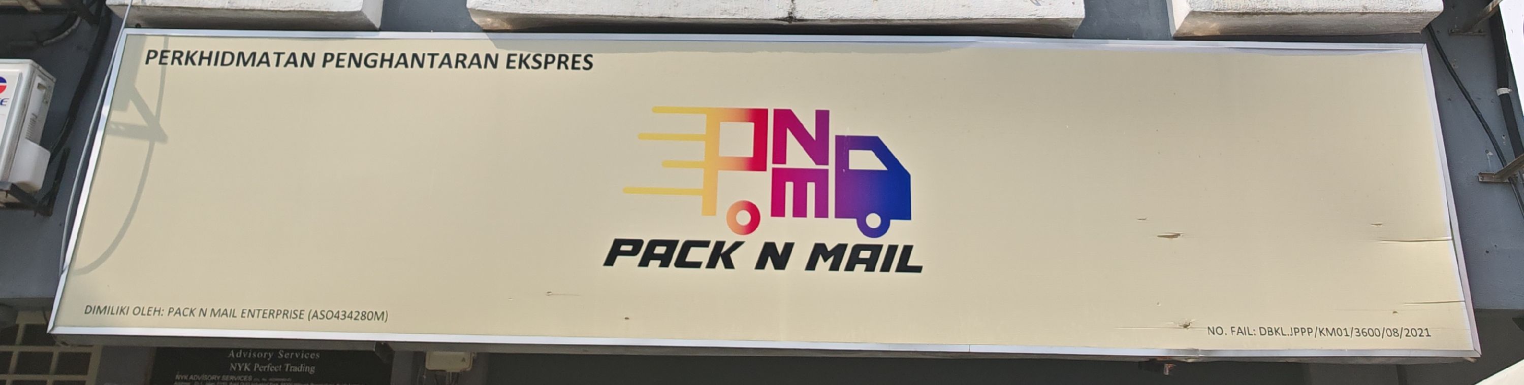
LL of KL LRT
Pasar Seni (Kelana Jaya line)
108653
Malaysia Kuala Lumpur
—
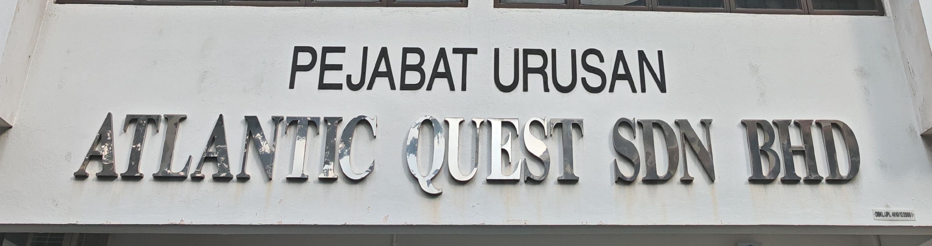
LL of KL LRT
Kampung Baru (Kelana Jaya line)
110189
Malaysia Kuala Lumpur
—
LL of KL LRT
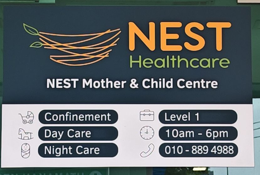
Taman Mutiara (MRT Kajang line)
110445
Malaysia Kuala Lumpur
—
LL of KL LRT
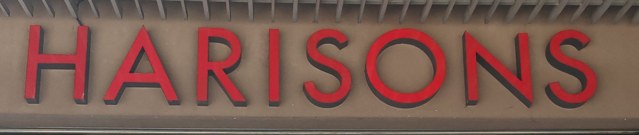
Kuchai (MRT Putrajaya line)
110701
Malaysia Kuala Lumpur
—
LL of KL LRT
Kuchai (MRT Putrajaya line)
103278
Malaysia Kuala Lumpur
—
LL of KL LRT
Muhibbah (Sri Petaling line)
103534
Malaysia Kuala Lumpur
—
LL of KL LRT
Sri Petaling (Sri Petaling line)
103790
Malaysia Kuala Lumpur
—
LL of KL LRT
Maluri (Ampang line)
104046
Malaysia Kuala Lumpur
—
LL of KL LRT
Maluri (Ampang line)
104302
Malaysia Kuala Lumpur
—
LL of KL LRT
Sungai Besi (Sri Petaling line)
104814
Malaysia Kuala Lumpur
—
LL of KL LRT
Bandar Tun Razak (Sri Petaling line)
105838
Malaysia Kuala Lumpur
—
LL of KL LRT
Pudu (Sri Petaling line)
106094
Malaysia Kuala Lumpur
—
LL of KL LRT
Pudu (Sri Petaling line)
106350
Malaysia Kuala Lumpur
—
LL of KL LRT
Plaza Rakyat (Sri Petaling line)
106606
Malaysia Kuala Lumpur
—
LL of KL LRT
Bandaraya (Sri Petaling line)
106862
Malaysia Kuala Lumpur
—
LL of KL LRT
Sultan Ismail (Sri Petaling line)
107118
Malaysia Kuala Lumpur
—
LL of KL LRT
Miharja (Ampang line)
107630
Malaysia Kuala Lumpur
—
LL of KL LRT
KL Sentral (Kelana Jaya line)
107886
Malaysia Kuala Lumpur
—
LL of KL LRT
Pasar Seni (Kelana Jaya line)
108654
Malaysia Kuala Lumpur
—
LL of KL LRT
Kampung Baru (Kelana Jaya line)
«
…
2189
2190
2191
2192
2193
2194
2195
2196
2197
2198
2199
…
»
×

")
")

")