This picture shows that the Malay language aligns the head of morphological compounds to the left, while English compounds are aligned with the head to the right.
155467
Deutschland
München
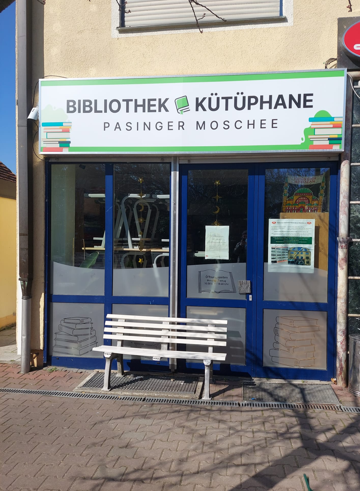
Das Zeichen richtet sich sowohl an deutschsprachige als auch an türkischsprachige Gemeindemitglieder und stellt eine Top-down-Initiative einer religiösen Institution dar. Es bezeichnet eine informative sowie institutionelle Funktion und kann dem Typ funktionale, institutionelle und identitätsbezogene Beschilderung zugeordnet werden. Verwendet werden Deutsch („Bibliothek“) und Türkisch („Kütüphane“) in paralleler und gleichrangiger Anordnung, ohne erkennbare Hierarchisierung, was auf eine institutionell verankerte Zweisprachigkeit hinweist. Im Gegensatz zu rein symbolischer Mehrsprachigkeit erfüllt die Beschilderung eine klar funktionale Rolle im Sinne von Orientierung und Zugang, wirkt jedoch zugleich identitätsstiftend. Hinsichtlich der Materialität und des Modus handelt es sich um ein fest installiertes Schild im Innen- oder Eingangsbereich der Institution. Die verwendete Schrift ist lateinisch.
English:
The sign is directed at both German-speaking and Turkish-speaking community members and represents a top-down initiative by a religious institution. It denotes an informational and institutional function and can be classified as functional, institutional, and identity-related signage. The languages used are German (“Bibliothek”) and Turkish (“Kütüphane”), arranged in a parallel and non-hierarchical manner, indicating an institutionally embedded bilingualism. In contrast to purely symbolic multilingualism, the signage fulfills a clearly functional role in terms of orientation and access, while simultaneously contributing to identity construction. In terms of materiality and mode, it consists of a fixed sign located inside or at the entrance of the institution. The script used is Latin.
Visible Turkish
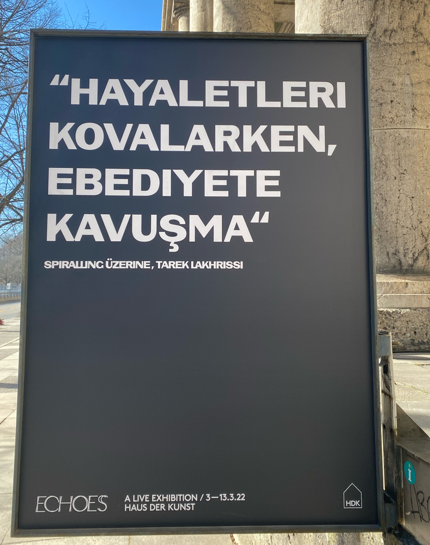
155593
Deutschland
München
Das Zeichen richtet sich an ein kulturinteressiertes, urbanes Publikum und stellt eine Top-down-Initiative einer kulturellen Institution dar. Es bezeichnet eine künstlerische bzw. expressive Funktion und kann dem Typ Ausstellungs- bzw. Veranstaltungsbeschilderung zugeordnet werden. Verwendet wird Türkisch („HAYALETLERI KOVALARKEN, EBEDIYETE KAVUŞMA“), das hier weniger als rein kommunikatives Mittel, sondern vielmehr als ästhetisches und symbolisches Ausdruckselement fungiert. Hinsichtlich der Materialität und des Modus handelt es sich um ein großformatiges, temporäres Ausstellungsplakat im öffentlichen Raum. Die verwendete Schrift ist lateinisch; auffällig ist jedoch eine selektive Abweichung von der türkischen Orthographie, da das spezifische Graphem „İ“ (großes i mit Punkt) nicht verwendet wird („HAYALETLERI“, „EBEDIYETE“ statt „HAYALETLERİ“, „EBEDİYETE“). Dies kann als Anpassung an dominante typographische oder nicht-türkische Schreibkonventionen interpretiert werden.
English:
The sign is directed at a culturally interested, urban audience and represents a top-down initiative by a cultural institution. It denotes an artistic or expressive function and can be classified as exhibition or event signage. The language used is Turkish (“HAYALETLERI KOVALARKEN, EBEDIYETE KAVUŞMA”), which here functions less as a purely communicative tool and more as an aesthetic and symbolic element of expression. In terms of materiality and mode, it consists of a large-scale, temporary exhibition poster in public space. The script used is Latin; however, a selective deviation from Turkish orthography is notable, as the specific grapheme “İ” (uppercase dotted i) is not used (“HAYALETLERI”, “EBEDIYETE” instead of “HAYALETLERİ”, “EBEDİYETE”). This can be interpreted as an adaptation to dominant typographic or non-Turkish writing conventions.
")
")
")
")
")
")
")
")


")