|
156143
|
ravzaaydin
|
Almanya
München
|
|
|
Deutsch:
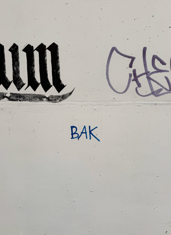
Das Zeichen richtet sich an ein breites, nicht näher spezifiziertes Publikum im öffentlichen Raum und stellt eine informelle, bottom-up produzierte Botschaft dar, die vermutlich aus individueller Initiative hervorgegangen ist. Es handelt sich um Graffiti mit primär expressiver und markierender Funktion und kann dem Typ nicht-institutioneller, spontaner Beschriftung (Tagging) zugeordnet werden. Der zentrale Schriftzug („BAK“) ist kurz, semantisch offen und ohne klaren Kontext, wodurch er eher als Signatur, Kürzel oder Identitätsmarker denn als informative Mitteilung interpretiert werden kann. Eine eindeutige sprachliche Zuordnung ist möglich (potenziell Türkisch, wo „bak“ „schau!“ bedeutet), jedoch bleibt die intendierte Bedeutung aufgrund des fehlenden Kontexts unklar.
Hinsichtlich der Materialität und des Modus handelt es sich um direkt auf die Wand aufgebrachte Graffiti (vermutlich mit Marker oder Spray) im urbanen Außenraum. Die verwendete Schrift basiert auf dem lateinischen Alphabet und weist eine einfache, schnelle und improvisierte Ausführung auf, ohne orthographische oder typografische Normorientierung.
English:
The sign is directed at a broad, unspecified audience in public space and represents an informal, bottom-up message likely created through individual initiative. It is a piece of graffiti with a primarily expressive and marking function and can be classified as non-institutional, spontaneous signage (tagging). The central inscription (“BAK”) is short, semantically open, and lacks clear context, suggesting it functions more as a signature, abbreviation, or identity marker rather than as an informative message. While a linguistic association is possible (potentially Turkish, where “bak” means “look!”), the intended meaning remains unclear due to the absence of contextual cues.
In terms of materiality and mode, it is graffiti applied directly onto a wall (likely with marker or spray) in an urban outdoor setting. The script is based on the Latin alphabet and shows a simple, quick, and improvised execution without adherence to orthographic or typographic norms.
|
Visible Turkish
|
|
|
156212
|
ravzaaydin
|
Almanya
München
|
|
|
Deutsch:
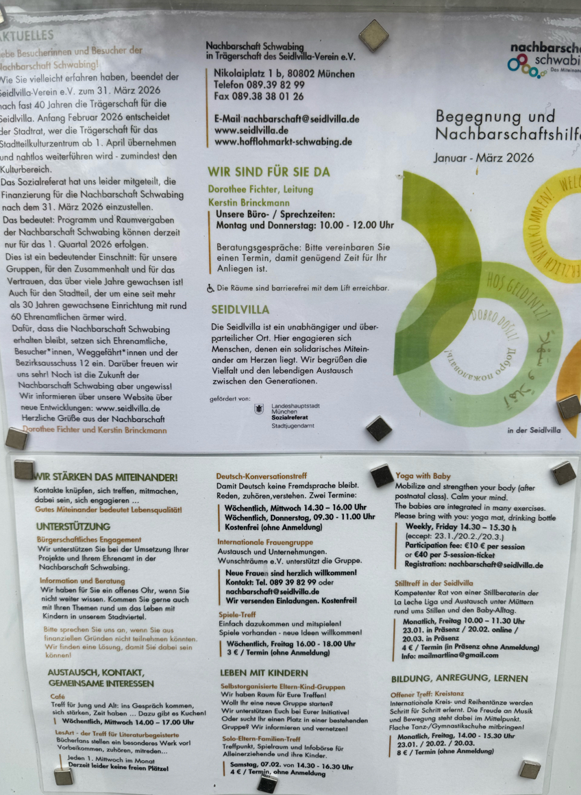
Das Zeichen richtet sich primär an deutschsprachige Bewohner:innen eines lokalen Stadtteils, bezieht jedoch zugleich ein mehrsprachiges, international geprägtes Publikum ein und stellt eine Top-down-Initiative einer kommunal eingebetteten Institution (Nachbarschaftszentrum) dar. Es bezeichnet eine informative sowie gemeinschafts- und identitätsbezogene Funktion und kann dem Typ programmatischer, organisatorischer und sozial-integrativer Beschilderung zugeordnet werden. Die dominante Sprache ist Deutsch (z. B. Informationen zu Veranstaltungen, Öffnungszeiten und organisatorischen Änderungen), wodurch die primäre Ausrichtung auf die lokale Mehrheitsgesellschaft deutlich wird.
Gleichzeitig wird durch die visuelle Integration mehrsprachiger Elemente – insbesondere des türkischen Ausdrucks „Hoş Geldiniz“ („Willkommen“) innerhalb eines grafischen Kreiselements – eine symbolische Mehrsprachigkeit hergestellt. Türkisch fungiert hier weniger als Träger konkreter Information, sondern vielmehr als Marker von Inklusion und kultureller Offenheit gegenüber migrantischen Gemeinschaften. Ergänzt wird dies durch weitere mehrsprachige Einsprengsel (z. B. „Dobro došli“), die zusammen eine pluralistische Willkommensbotschaft erzeugen. Die Mehrsprachigkeit erfüllt somit primär eine symbolisch-identitätsstiftende Funktion, während die eigentliche Informationsvermittlung überwiegend auf Deutsch erfolgt.
Visuell ist das Plakat dicht strukturiert und textlastig, mit klar segmentierten Informationsblöcken. Die mehrsprachigen Begrüßungselemente sind grafisch hervorgehoben (farbige Kreise), wodurch sie sich von den funktionalen Textteilen abheben und eine einladende, gemeinschaftsorientierte Atmosphäre schaffen. Hinsichtlich der Materialität und des Modus handelt es sich um ein gedrucktes, öffentlich ausgehängtes Informationsplakat. Die verwendete Schrift ist überwiegend lateinisch; orthographische Besonderheiten treten nicht hervor, da die Texte standardsprachlich formuliert sind.
English:
The sign is primarily directed at German-speaking residents of a local neighborhood, while also addressing a multilingual and internationally diverse audience, and represents a top-down initiative by a community-based institutional actor (neighborhood center). It denotes an informational as well as community-building and identity-related function and can be classified as programmatic, organizational, and socially integrative signage. German is the dominant language (e.g., information on events, opening hours, and organizational changes), indicating a primary orientation toward the local majority population.
At the same time, the visual integration of multilingual elements—most notably the Turkish expression “Hoş Geldiniz” (“Welcome”) within a circular graphic—creates symbolic multilingualism. Turkish here functions less as a carrier of concrete information and more as a marker of inclusion and cultural openness toward migrant communities. This is complemented by other multilingual insertions (e.g., “Dobro došli”), which together form a pluralistic message of welcome. Thus, multilingualism primarily serves a symbolic and identity-building function, while actual information is conveyed mainly in German.
Visually, the poster is dense and text-heavy, with clearly segmented informational blocks. The multilingual welcome elements are graphically highlighted (colored circles), distinguishing them from the functional text and contributing to an inviting, community-oriented atmosphere. In terms of materiality and mode, it is a printed informational poster displayed in public space. The script used is predominantly Latin, and orthography follows standard conventions without notable deviations.
|
Visible Turkish
|
|
")
")
")
")
")
")