|
ID |
Nickname |
Country / City |
Languages |
Taxonomies |
Comment |
Project / Group |
Map |
|
74441
|
|
Allemagne
Siegen
|
|
|
—
|
|
|
|
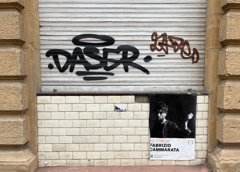
100067
|
GMA
|
Allemagne
Karlsruhe
|
|
|
—
|
KAGraffiti
|
|

|
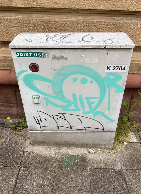
100083
|
GMA
|
Allemagne
Karlsruhe
|
|
|
—
|
KAGraffiti
|
|
|
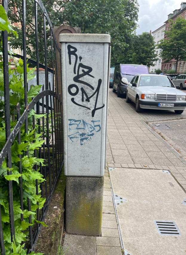
100084
|
GMA
|
Allemagne
Karlsruhe
|
|
|
—
|
KAGraffiti
|
|
|
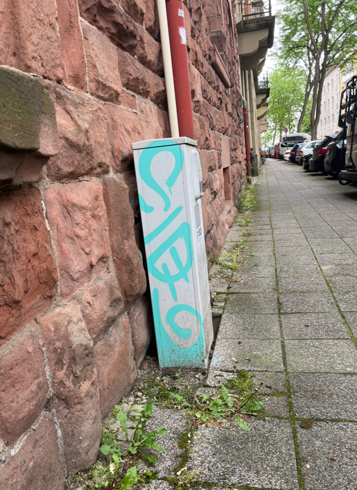
100086
|
GMA
|
Allemagne
Karlsruhe
|
|
|
—
|
KAGraffiti
|
|
|
100087
|
GMA
|
Allemagne
Karlsruhe
|
|
|
—
|
KAGraffiti
|
|
|
100088
|
GMA
|
Allemagne
Karlsruhe
|
|
|
—
|
KAGraffiti
|
|
|
100089
|
GMA
|
Allemagne
Karlsruhe
|
|
|
—
|
KAGraffiti
|
|
|
100091
|
GMA
|
Allemagne
Karlsruhe
|
|
|
—
|
KAGraffiti
|
|
|
100093
|
GMA
|
Allemagne
Karlsruhe
|
|
|
—
|
KAGraffiti
|
|
|
100094
|
GMA
|
Allemagne
Karlsruhe
|
|
|
—
|
KAGraffiti
|
|
|
156694
|
ravzaaydin
|
Almanya
München
|
|
|
—
|
Visible Turkish
|
|
|
156695
|
ravzaaydin
|
Almanya
München
|
|
|
—
|
Visible Turkish
|
|
|
156212
|
ravzaaydin
|
Almanya
München
|
|
|
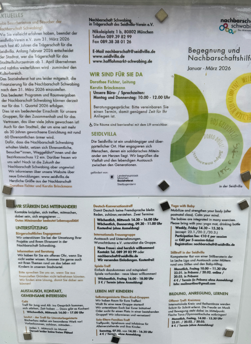
Deutsch:
Das Zeichen richtet sich primär an deutschsprachige Bewohner:innen eines lokalen Stadtteils, bezieht jedoch zugleich ein mehrsprachiges, international geprägtes Publikum ein und stellt eine Top-down-Initiative einer kommunal eingebetteten Institution (Nachbarschaftszentrum) dar. Es bezeichnet eine informative sowie gemeinschafts- und identitätsbezogene Funktion und kann dem Typ programmatischer, organisatorischer und sozial-integrativer Beschilderung zugeordnet werden. Die dominante Sprache ist Deutsch (z. B. Informationen zu Veranstaltungen, Öffnungszeiten und organisatorischen Änderungen), wodurch die primäre Ausrichtung auf die lokale Mehrheitsgesellschaft deutlich wird.
Gleichzeitig wird durch die visuelle Integration mehrsprachiger Elemente – insbesondere des türkischen Ausdrucks „Hoş Geldiniz“ („Willkommen“) innerhalb eines grafischen Kreiselements – eine symbolische Mehrsprachigkeit hergestellt. Türkisch fungiert hier weniger als Träger konkreter Information, sondern vielmehr als Marker von Inklusion und kultureller Offenheit gegenüber migrantischen Gemeinschaften. Ergänzt wird dies durch weitere mehrsprachige Einsprengsel (z. B. „Dobro došli“), die zusammen eine pluralistische Willkommensbotschaft erzeugen. Die Mehrsprachigkeit erfüllt somit primär eine symbolisch-identitätsstiftende Funktion, während die eigentliche Informationsvermittlung überwiegend auf Deutsch erfolgt.
Visuell ist das Plakat dicht strukturiert und textlastig, mit klar segmentierten Informationsblöcken. Die mehrsprachigen Begrüßungselemente sind grafisch hervorgehoben (farbige Kreise), wodurch sie sich von den funktionalen Textteilen abheben und eine einladende, gemeinschaftsorientierte Atmosphäre schaffen. Hinsichtlich der Materialität und des Modus handelt es sich um ein gedrucktes, öffentlich ausgehängtes Informationsplakat. Die verwendete Schrift ist überwiegend lateinisch; orthographische Besonderheiten treten nicht hervor, da die Texte standardsprachlich formuliert sind.
English:
The sign is primarily directed at German-speaking residents of a local neighborhood, while also addressing a multilingual and internationally diverse audience, and represents a top-down initiative by a community-based institutional actor (neighborhood center). It denotes an informational as well as community-building and identity-related function and can be classified as programmatic, organizational, and socially integrative signage. German is the dominant language (e.g., information on events, opening hours, and organizational changes), indicating a primary orientation toward the local majority population.
At the same time, the visual integration of multilingual elements—most notably the Turkish expression “Hoş Geldiniz” (“Welcome”) within a circular graphic—creates symbolic multilingualism. Turkish here functions less as a carrier of concrete information and more as a marker of inclusion and cultural openness toward migrant communities. This is complemented by other multilingual insertions (e.g., “Dobro došli”), which together form a pluralistic message of welcome. Thus, multilingualism primarily serves a symbolic and identity-building function, while actual information is conveyed mainly in German.
Visually, the poster is dense and text-heavy, with clearly segmented informational blocks. The multilingual welcome elements are graphically highlighted (colored circles), distinguishing them from the functional text and contributing to an inviting, community-oriented atmosphere. In terms of materiality and mode, it is a printed informational poster displayed in public space. The script used is predominantly Latin, and orthography follows standard conventions without notable deviations.
|
Visible Turkish
|
|

|
155475
|
ravzaaydin
|
Almanya
München
|
|
|
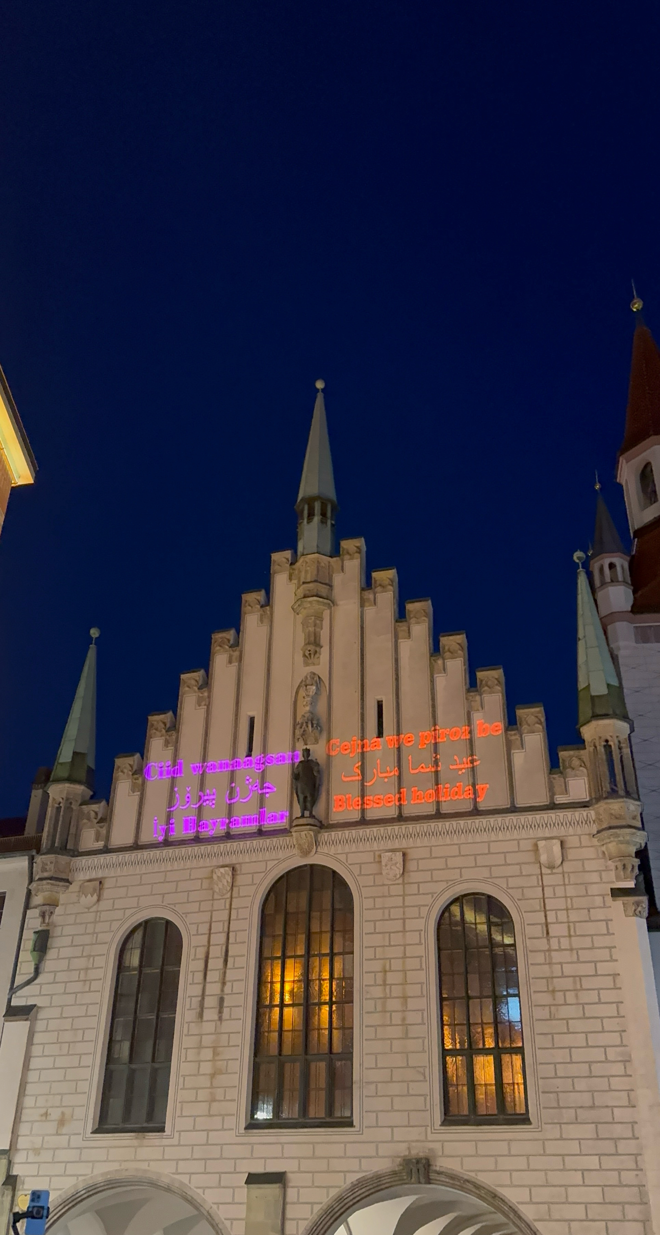
A multilingual Eid celebration was held at the old municipal building on the first day of Ramadan feast.. The phrase “iyi bayramlar” was included for the Turkish community
|
|
|
|
155779
|
ravzaaydin
|
Almanya
München
|
|
|
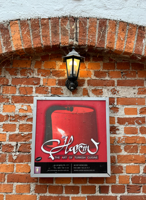
Das Zeichen richtet sich an ein breites, auch internationales Publikum und stellt eine Top-down-Initiative eines kommerziellen Unternehmens dar. Es bezeichnet eine kommerzielle sowie teilweise folkloristische Funktion und kann dem Typ Werbe- bzw. Geschäftsbeschilderung zugeordnet werden. Verwendet werden Englisch („The Art of Turkish Cuisine“, „Turkish Cuisine“) sowie ein kulturell konnotierter Eigenname („Harem“), wobei Englisch eine internationale und prestigeträchtige Ansprache ermöglicht, während der Name und die Referenz auf türkische Küche das Angebot kulturell rahmen. Hinsichtlich der Materialität und des Modus handelt es sich um ein fest installiertes Geschäftsschild mit ausgeprägten visuellen Elementen. Die verwendete Schrift ist lateinisch. Besonders hervorzuheben ist das visuelle Element des Fes, das als folkloristisches Symbol fungiert und eine stereotypisierte, ästhetisierte Vorstellung von „Türkischsein“ innerhalb eines kommerziellen Diskurses inszeniert.
English:
The sign is directed at a broad, including international, audience and represents a top-down initiative by a commercial business. It denotes a commercial as well as partly folkloric function and can be classified as commercial or business signage. The languages used include English (“The Art of Turkish Cuisine”, “Turkish Cuisine”) as well as a culturally connoted proper name (“Harem”), with English enabling an international and prestigious appeal, while the name and reference to Turkish cuisine frame the offer culturally. In terms of materiality and mode, it consists of a fixed shop sign with pronounced visual elements. The script used is Latin. Particularly noteworthy is the visual element of the fez, which functions as a folkloric symbol and stages a stereotyped and aestheticized notion of “Turkishness” within a commercial discourse.
|
Visible Turkish
|
|
|
155545
|
ravzaaydin
|
Almanya
München
|
|
|
Das Zeichen richtet sich gezielt an religiös geprägte, migrantische bzw. diasporische Gemeinschaften und stellt eine Top-down-Initiative im urbanen öffentlichen Raum dar. Es bezeichnet eine expressive, religiöse sowie symbolisch-performative Funktion und kann dem Typ temporäre, festbezogene öffentliche Beschilderung zugeordnet werden. Verwendet werden mehrere Sprachen und Varietäten, darunter Türkisch, Arabisch, Kurdisch (Kurmancî), Somali sowie Englisch, die teilweise in unterschiedlichen Schriften realisiert sind. Auffällig ist dabei die Abwesenheit des Deutschen, obwohl sich das Zeichen im deutschsprachigen Kontext befindet, was auf eine gezielte Adressierung spezifischer Communities statt einer allgemeinen Öffentlichkeit hinweist. Die sprachliche Auswahl umfasst nicht nur global verbreitete Sprachen, sondern auch diasporische Sprachen und verweist damit auf einen superdiversen urbanen Kontext. Hinsichtlich der Materialität und des Modus handelt es sich um eine temporäre Lichtinstallation auf der Fassade eines historischen Gebäudes. Die verwendeten Schriften variieren je nach Sprache (u. a. lateinisch und arabisch) und unterstreichen die visuelle Inszenierung von Mehrsprachigkeit als Marker von Zugehörigkeit, Sichtbarkeit und Inklusion im öffentlichen Raum.
English:
The sign is specifically directed at religiously shaped migrant and diasporic communities and represents a top-down initiative in the urban public space. It denotes an expressive, religious, and symbolically performative function and can be classified as temporary, event-related public signage. Multiple languages and varieties are used, including Turkish, Arabic, Kurdish (Kurmancî), Somali, and English, some of which are rendered in different scripts. Notably, German is absent despite the sign being located in a German-speaking context, which indicates a targeted address to specific communities rather than the general public. The linguistic selection goes beyond globally widespread languages and includes diasporic languages, pointing to a superdiverse urban environment. In terms of materiality and mode, it consists of a temporary light installation on the façade of a historic building. The scripts vary depending on the language (including Latin and Arabic), reinforcing the visual staging of multilingualism as a marker of belonging, visibility, and inclusion in public space.
|
Visible Turkish
|
|
|
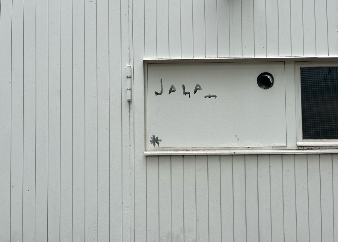
156142
|
ravzaaydin
|
Almanya
München
|
|
|
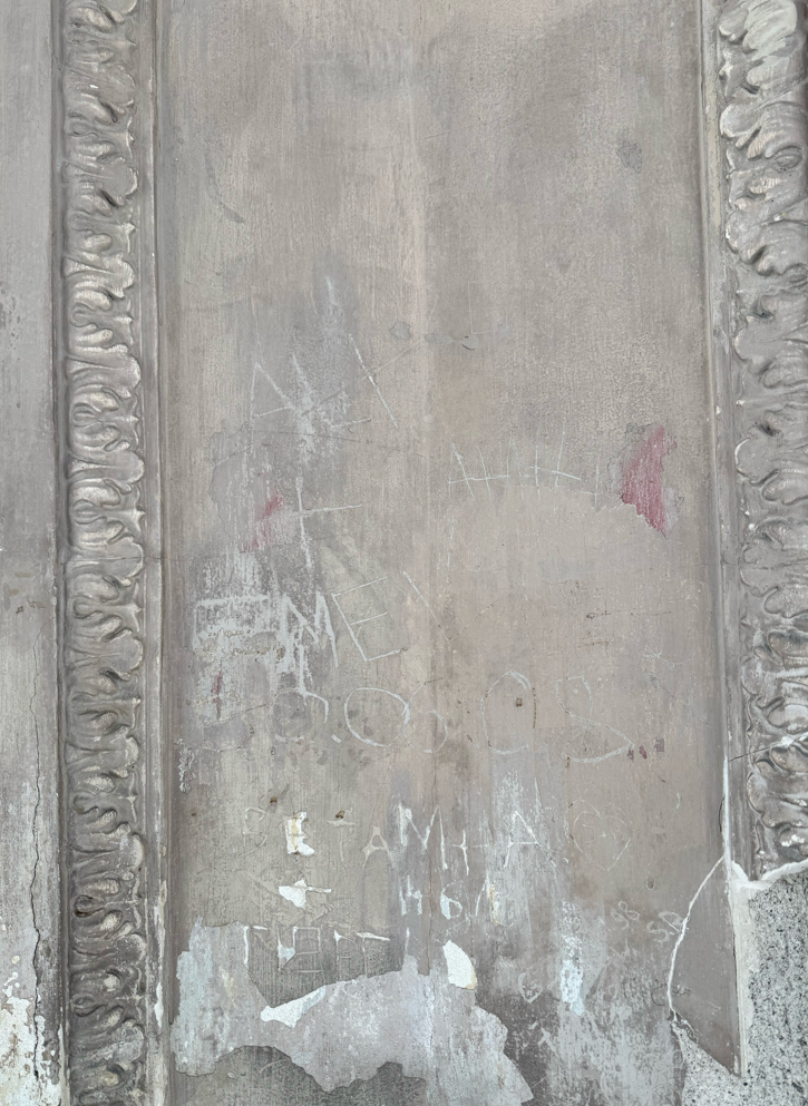
Deutsch
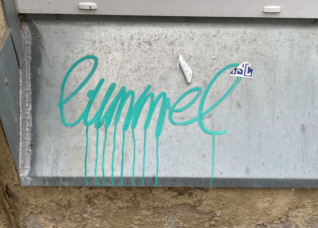
Das Zeichen richtet sich nicht an eine klar definierte Zielgruppe, sondern an einen unbestimmten urbanen Raum und stellt eine Bottom-up-Initiative individueller Akteur:innen dar. Es bezeichnet eine expressive sowie subkulturelle Funktion und kann dem Typ Graffiti bzw. informelle Ritzinschrift zugeordnet werden. Verwendet wird vermutlich Türkisch („Ali Emel“), wobei es sich weniger um eine informative Aussage als vielmehr um eine Namensmarkierung handelt, die individuelle Präsenz und Aneignung von Raum ausdrückt. Die sprachliche Form ist minimal und reduziert, wodurch die Funktion der Selbstpositionierung gegenüber kommunikativer Verständlichkeit in den Vordergrund tritt. Hinsichtlich der Materialität und des Modus handelt es sich um eine eingeritzte Inschrift auf einer Wandoberfläche im öffentlichen Raum. Die verwendete Schrift ist lateinisch; orthographische Aspekte sind hier nicht zentral, vielmehr steht die Praxis des Einschreibens selbst als symbolischer Akt der Raumaneignung im Fokus.
English
The sign is not directed at a clearly defined audience but rather occupies an undifferentiated urban space and represents a bottom-up initiative by individual actors. It denotes an expressive and subcultural function and can be classified as graffiti or informal scratch inscription. The language used is presumably Turkish (“Ali Emel”), though it functions less as an informational statement and more as a name inscription marking individual presence and spatial appropriation. The linguistic form is minimal and reduced, foregrounding self-positioning over communicative clarity. In terms of materiality and mode, it consists of a scratched inscription on a wall surface in public space. The script used is Latin; orthographic aspects are not central here, as the act of inscription itself becomes the primary symbolic practice of claiming space.
|
Visible Turkish
|
|
|
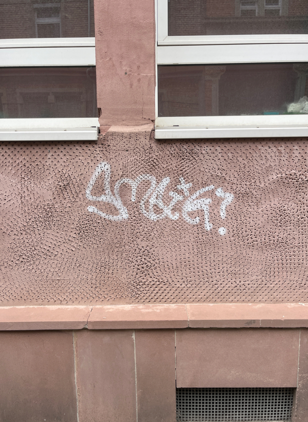
156143
|
ravzaaydin
|
Almanya
München
|
|
|
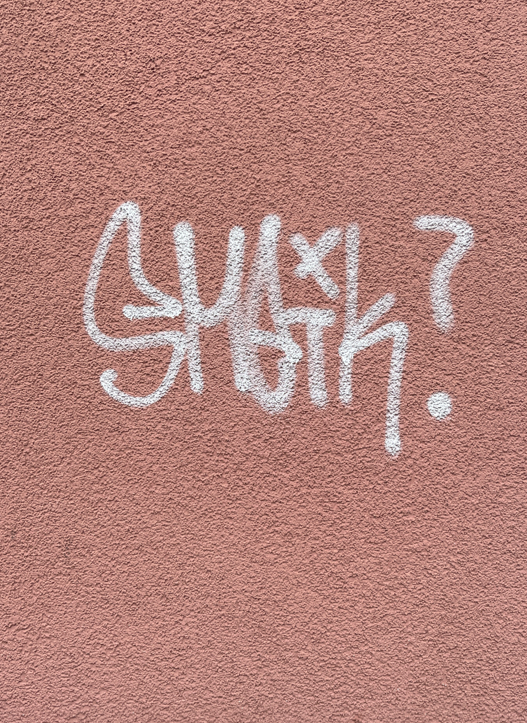
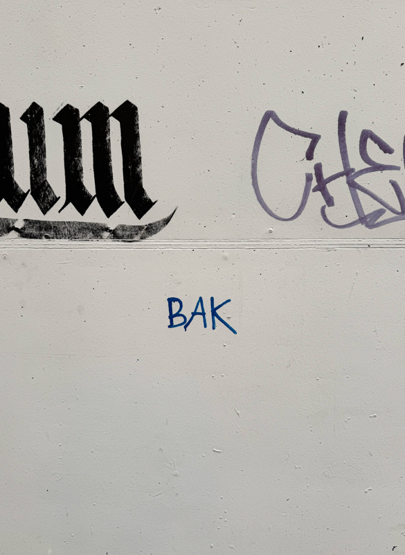
Deutsch:
Das Zeichen richtet sich an ein breites, nicht näher spezifiziertes Publikum im öffentlichen Raum und stellt eine informelle, bottom-up produzierte Botschaft dar, die vermutlich aus individueller Initiative hervorgegangen ist. Es handelt sich um Graffiti mit primär expressiver und markierender Funktion und kann dem Typ nicht-institutioneller, spontaner Beschriftung (Tagging) zugeordnet werden. Der zentrale Schriftzug („BAK“) ist kurz, semantisch offen und ohne klaren Kontext, wodurch er eher als Signatur, Kürzel oder Identitätsmarker denn als informative Mitteilung interpretiert werden kann. Eine eindeutige sprachliche Zuordnung ist möglich (potenziell Türkisch, wo „bak“ „schau!“ bedeutet), jedoch bleibt die intendierte Bedeutung aufgrund des fehlenden Kontexts unklar.
Hinsichtlich der Materialität und des Modus handelt es sich um direkt auf die Wand aufgebrachte Graffiti (vermutlich mit Marker oder Spray) im urbanen Außenraum. Die verwendete Schrift basiert auf dem lateinischen Alphabet und weist eine einfache, schnelle und improvisierte Ausführung auf, ohne orthographische oder typografische Normorientierung.
English:
The sign is directed at a broad, unspecified audience in public space and represents an informal, bottom-up message likely created through individual initiative. It is a piece of graffiti with a primarily expressive and marking function and can be classified as non-institutional, spontaneous signage (tagging). The central inscription (“BAK”) is short, semantically open, and lacks clear context, suggesting it functions more as a signature, abbreviation, or identity marker rather than as an informative message. While a linguistic association is possible (potentially Turkish, where “bak” means “look!”), the intended meaning remains unclear due to the absence of contextual cues.
In terms of materiality and mode, it is graffiti applied directly onto a wall (likely with marker or spray) in an urban outdoor setting. The script is based on the Latin alphabet and shows a simple, quick, and improvised execution without adherence to orthographic or typographic norms.
|
Visible Turkish
|
|
|
34888
|
|
Antigua and Barbuda
Saint John's
|
|
|
—
|
|
|
")
")
")
")
")
")
")