|
ID |
Nickname |
Country / City |
Languages |
Taxonomies |
Comment |
Project / Group |
Map |
|
135895
|
Laura_Pizarro_Jacinto
|
Spain
Cáceres
|
|
|
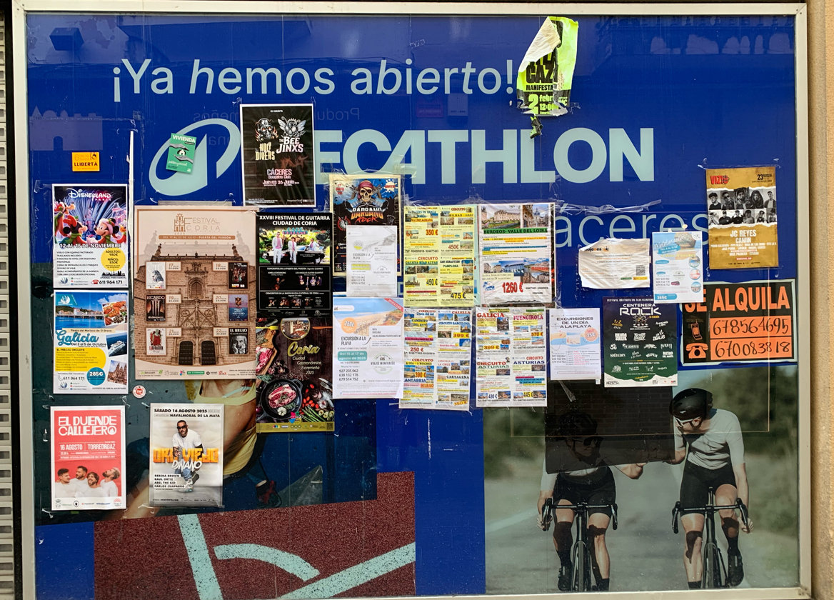
Main languages present:
Spanish : Almost all posters are in Spanish (concerts, cultural events, excursions, rentals, etc.).
English : Appears in some brand names and event titles:
"DECATHLON" (store name in background)
Concert poster: Bee Jinx (band name, English words)
"Rock", "Festival" (international terms, often borrowed).
Commercial: Travel agencies, excursion offers, rental ads, restaurants.
Cultural: Festivals (guitar, music, rock concerts, local fairs).
Entertainment: Posters for concerts, DJs, shows.
Housing: “SE ALQUILA” (For Rent).
Activism/Associations: One small poster mentions a manifestation (protest).
Strong use of visual variety : colorful posters, different fonts, images to attract attention. Youth culture (music, festivals), local economy (excursions, rentals), and globalization (English in band names and events).
Multilingualism is minimal : English is not for communication but for symbolic prestige (cool, modern, international).
The board acts as a community communication space : locals, businesses, and cultural groups all compete for visibility. This reflects Spanish monolingual dominance with selective English borrowing.
In Extremadura (border with Portugal), one might expect some Portuguese, but here it seems absent: suggests a more local + national Spanish orientation rather than cross-border.
|
PALRA
|
|
|
135896
|
Laura_Pizarro_Jacinto
|
Spain
Cáceres
|
|
|
—
|
PALRA
|
|
|
135897
|
Laura_Pizarro_Jacinto
|
Spain
Cáceres
|
|
|
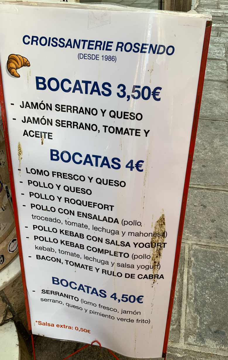
Languages present
French:
Croissanterie (borrowed from croissant + suffix, common in France). Suggests tradition, authenticity, or prestige associated with French bakery culture.
Roquefort (French cheese).
Spanish :
Menu items: bocatas, jamón serrano, queso, lomo fresco, pollo, roquefort, ensalada, salsa yogurt, serranito.
Pricing: 3,50€, 4€, 4,50€, salsa extra 0,50€.
English loanword (influenced): Bacon (not translated, reflects globalized food vocabulary).
Other languages as culinary references:
Kebab, yogurt (Middle Eastern/Mediterranean influences).
|
PALRA
|
|
|
135898
|
Laura_Pizarro_Jacinto
|
Spain
Cáceres
|
|
|
—
|
PALRA
|
|
|
135899
|
Laura_Pizarro_Jacinto
|
Spain
Cáceres
|
|
|
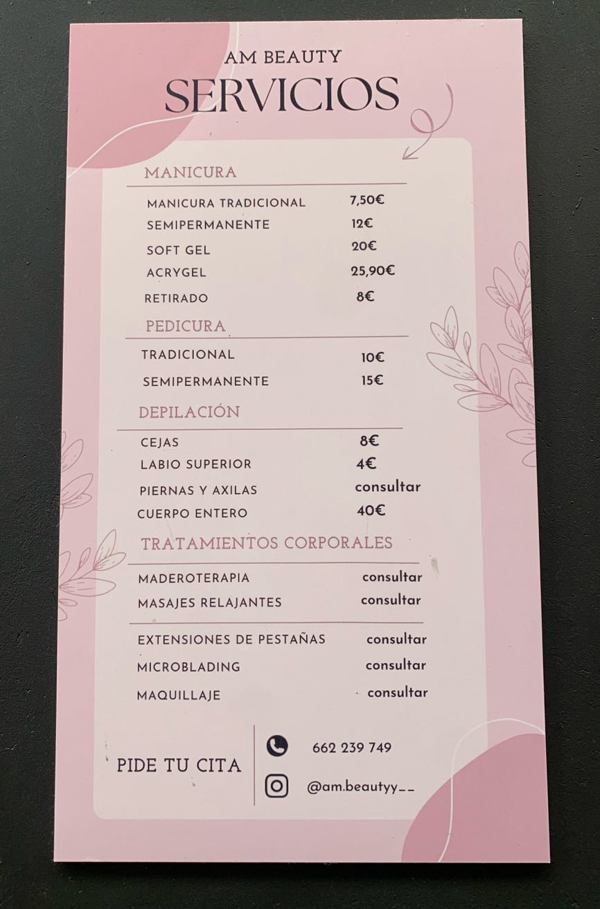
Spanish:
Headings: Servicios, Manicura, Pedicura, Depilación, Tratamientos Corporales.
Service details: Manicura tradicional, pedicura, cejas, cuerpo entero, maquillaje, masajes relajantes.
English (minor presence, branding): The business name AM Beauty is in English, which is common in the beauty/cosmetics industry to add prestige and global appeal.
|
PALRA
|
|
|
135900
|
Laura_Pizarro_Jacinto
|
Spain
Cáceres
|
|
|
—
|
PALRA
|
|
|
135901
|
Laura_Pizarro_Jacinto
|
Spain
Cáceres
|
|
|
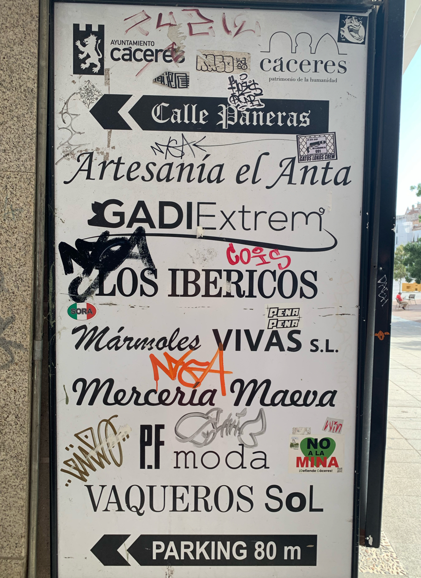
Spanish:
Institutional: Ayuntamiento Cáceres, Cáceres patrimonio de la humanidad, Calle Paneras.
Commercial: Artesanía el Anta, Los Ibéricos, Mármoles Vivas, Mercería Maeva, Moda, Vaqueros Sol.
English (minor, visual):
Parking 80m., Moda could be read as Italian/Spanish but internationally linked to “fashion”; graffiti tags sometimes use English letters or neutral global hip-hop styles.
Multimodal protest language: Sticker “No a la mina – ¡Defiende Cáceres!” (Spanish, activist discourse).
Heritage vs. commerce: Signboard originally designed to guide visitors in the historic city (UNESCO site), blending cultural identity (Cáceres as heritage city) with everyday commerce.
Resistance discourse: “No a la mina” sticker transforms the commercial/official board into a site of political struggle, connecting local economy with environmental defense.
Semiotic battle: Graffiti tags partially obscure shop names : reflects youth/street culture presence challenging institutional order.
Spatial hierarchy: Official/municipal logos sit on top; grassroots layers accumulate below and across, literally overwriting heritage and commerce narratives.
|
PALRA
|
|
|
135902
|
Laura_Pizarro_Jacinto
|
Spain
Cáceres
|
|
|
—
|
PALRA
|
|
|
135903
|
Laura_Pizarro_Jacinto
|
Spain
Cáceres
|
|
|
—
|
PALRA
|
|
|
135904
|
Laura_Pizarro_Jacinto
|
Spain
Cáceres
|
|
|
—
|
PALRA
|
|
|
135905
|
Laura_Pizarro_Jacinto
|
Spain
Cáceres
|
|
|
—
|
PALRA
|
|
|
135906
|
Laura_Pizarro_Jacinto
|
Spain
Cáceres
|
|
|
—
|
PALRA
|
|
|
135907
|
Laura_Pizarro_Jacinto
|
Spain
Cáceres
|
|
|
—
|
PALRA
|
|
|
135908
|
Laura_Pizarro_Jacinto
|
Spain
Cáceres
|
|
|
—
|
PALRA
|
|
|
135910
|
Laura_Pizarro_Jacinto
|
Spain
Cáceres
|
|
|
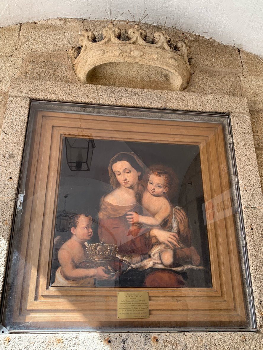
Language Spanish
Top-down discourse: the plaque is clearly institutional heritage signage (commemorative brass plate, official tone). No commercial or bottom-up interventions visible (unlike stickers/posters elsewhere in Plaza Mayor).
Provides precise dates: painting originally exhibited 1865–1992. Reinstalled as a replica in 2013.
Refers to La Virgen de la Paz and its local devotional meaning (La Virgen de los Partos). Religious references in public signage = Catholic heritage embedded in urban landscape. Sign anchors collective memory and identity in a religious artwork linked to fertility beliefs.
Lexicon: devoción, profesaban, prenadas reflects both archaic religious discourse and medical-social language about women. Reinforces gendered cultural practices in heritage narratives.
|
PALRA
|
|
|
135911
|
Laura_Pizarro_Jacinto
|
Spain
Cáceres
|
|
|
—
|
PALRA
|
|
|
135912
|
Laura_Pizarro_Jacinto
|
Spain
Cáceres
|
|
|
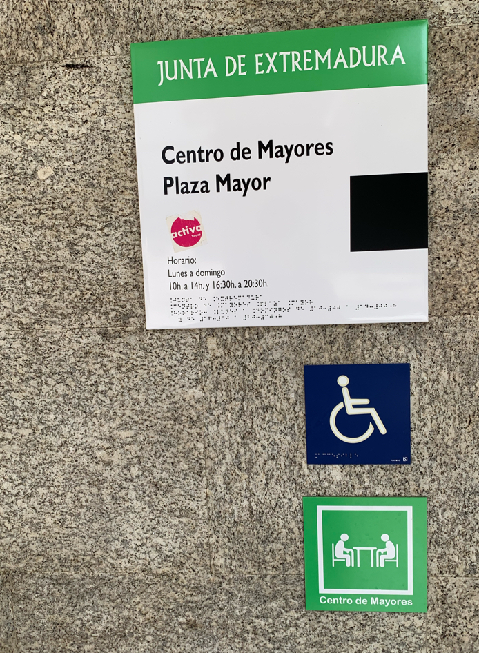
Spanish (official language, top-down)
Junta de Extremadura = regional government authority.
Centro de Mayores Plaza Mayor = “Senior Center Plaza Mayor.”
Horario: Lunes a domingo 10h. a 14h. y 16:30h. a 20:30h. = “Opening hours: Monday to Sunday, 10:00–14:00 and 16:30–20:30.”
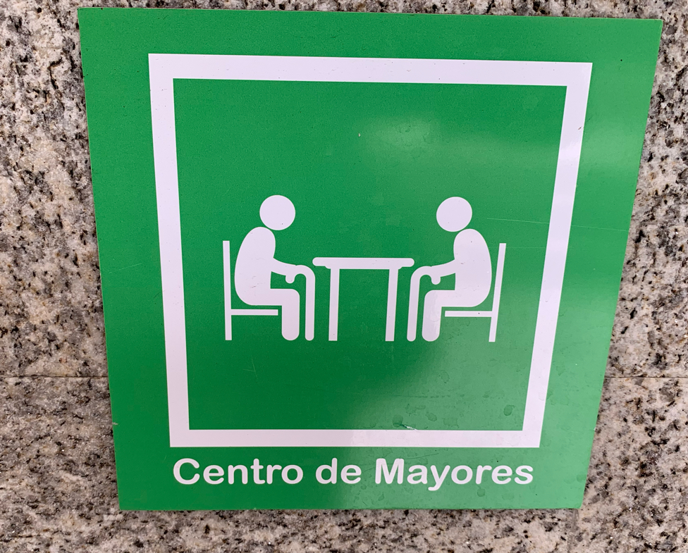
Centro de Mayores (repeated on green pictogram).
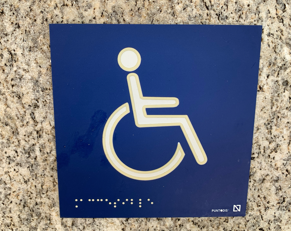
Braille (tactile writing system)
Appears twice: under the institutional sign and on the blue wheelchair accessibility symbol. Ensures inclusive access for blind/visually impaired people.
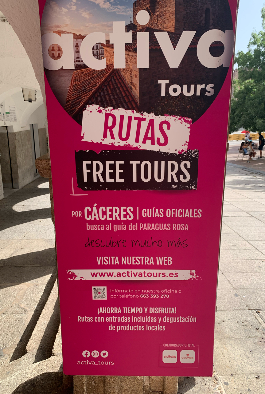
English (through sticker intrusion)
The pink sticker activa Tours includes the English word Tours. Represents tourism branding entering institutional space.
Visual/pictorial languages (icons)
Blue wheelchair pictogram: international symbol of accessibility.
Green pictogram: two stylized human figures at a table = symbol of a senior center.
This sign at the Plaza Mayor Senior Center demonstrates how top-down state signage (Spanish + Braille + pictograms) ensures accessibility and inclusivity, while bottom-up elements (sticker in Spanish/English) create a hybrid, layered linguistic landscape. The use of visual codes (icons, color, Braille) highlights how accessibility is as much semiotic as linguistic, expanding the concept of “language” in the public space.
|
PALRA
|
|
|
135913
|
Laura_Pizarro_Jacinto
|
Spain
Cáceres
|
|
|
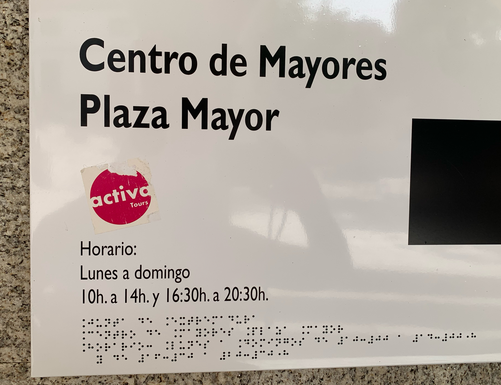
Spanish (text)
Centro de Mayores Plaza Mayor = “Senior Center Plaza Mayor.”
Horario: Lunes a domingo 10h. a 14h. y 16:30h. a 20:30h. = “Opening hours: Monday to Sunday, 10:00–14:00 and 16:30–20:30.”
Braille (tactile writing system)
The same information is repeated in Braille at the bottom. Ensures visually impaired users can also read the center’s function and schedule.
Sticker (English + branding):
A sticker says activa Tours. This introduces English vocabulary and a commercial intrusion into a formal sign. Shows how bottom-up signage (stickers) overlaps with top-down institutional signage.
|
PALRA
|
|
|
135914
|
Laura_Pizarro_Jacinto
|
Spain
Cáceres
|
|
|
—
|
PALRA
|
|
|
135915
|
Laura_Pizarro_Jacinto
|
Spain
Cáceres
|
|
|
Pictorial language (universal symbol): White wheelchair icon on blue background = globally recognized symbol for accessibility. Used in transport, public buildings, toilets, tourist areas.
Braille (tactile writing system): Below the pictogram, there is a line of Braille dots (Spanish Braille alphabet). This inclusion is crucial for visually impaired users.
Typography / Branding: Bottom right: PUNTODIS (Spanish company specializing in accessibility signage). A small square logo further emphasizes its institutional nature.
Multimodality for accessibility
Combines visual language (icon) and tactile language (Braille).
Makes the sign accessible to both sighted and visually impaired users.
Universal vs. local layers
The wheelchair icon is globally understood, part of an international semiotic system.
The Braille, however, is localized in Spanish Braille, adapting accessibility to the local language context.
Top-down institutional signage: Installed by municipal or regional authorities, reflecting legal frameworks on accessibility and inclusion in Spain.
Materiality and placement: The sign is printed on durable plastic/metal, fixed to stone — integrating modern accessibility requirements into a heritage urban landscape like Cáceres.
|
PALRA
|
|
")
")
")
